What's new

Help Need suggestions/criticism to my gamify app design

PHC-AlbertzZ

Forum Veteran
Elite
Joined
May 9, 2015
Posts
1,311
Solutions
2
Reaction
1,905
Points
565
My concern are:
  • Oks na ba yung color combinations ng theme ko (Light & Dark)?
  • How about the font okay na kaya to?
  • and the arrangements of the content is it good?

Yan lang mga master, hindi pa ako ma satisfied sa design ko now hihi.

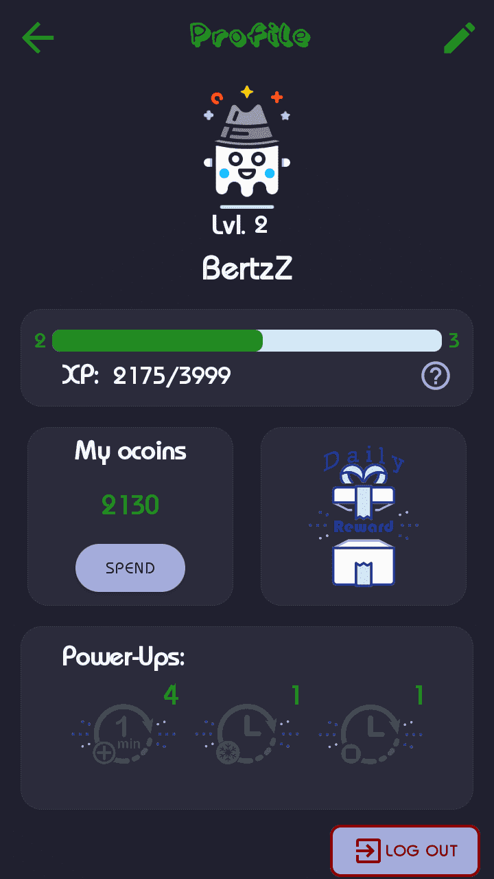
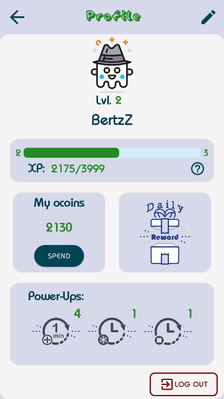
Here some screenshots of my app:

Profile Activity Layout (Light & Dark Theme)
Screenshot_20210929-121402_My_Omoshiroi.png
Screenshot_20210929-121203_My_Omoshiroi.png


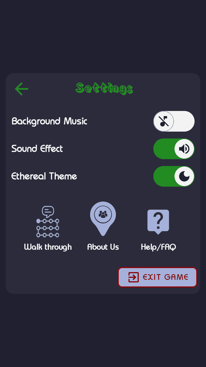
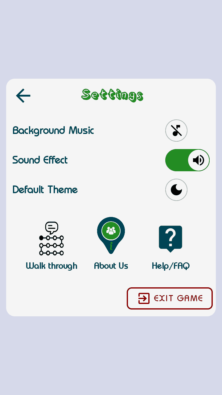
Settings Activity Layout
Screenshot_20210928-185342_My_Omoshiroi.png
Screenshot_20210928-185403_My_Omoshiroi.png

Any Bad or Good criticism i will accept 😇😇
and suggestions.

Salamat muli. 😇😻
 

Attachments

Yung daily reward icon di uniform sa theme gawin mong kasing kulay nung dark bluegreen lalo pag sa dark mode di magandang tingnan.
Yung walk through icon medyo out of place yung dalawang icon na katabi niya may fill siya lang yung naiiba.
Yung Profile at Settings na heading medyo weird sa dark mode.

Then yung EXIT GAME game medyo out place din kasi kailangan mo pa pala pumunta sa settings para iclose yung game, usually sa mga game or apps pag icoclose natin its either you press the home button or back button sa phone, siguro ok lang na nandiyan yung EXIT GAME if pag nag back ka diretso sa settings, if not it should be on a separate window or a pop up.

Tapos may LOG OUT din pala sa profile, sa tingin ko dapat magkasama sila ng exit game.

12.png

Parang ganito na may separate panel para sa LOG OUT and EXIT GAME

Kuha ka ng icon dito madami naman choices and free lang: You do not have permission to view the full content of this post. Log in or register now.
Mag login ka pwede naman kahit yung gmail lang para ma edit mo yung color para maging uniform sa theme mo.
 

Attachments

Last edited:
Yung daily reward icon di uniform sa theme gawin mong kasing kulay nung dark bluegreen lalo pag sa dark mode di magandang tingnan.
Yung walk through icon medyo out of place yung dalawang icon na katabi niya may fill siya lang yung naiiba.
Yung Profile at Settings na heading medyo weird sa dark mode.

Then yung EXIT GAME game medyo out place din kasi kailangan mo pa pala pumunta sa settings para iclose yung game, usually sa mga game or apps pag icoclose natin its either you press the home button or back button sa phone, siguro ok lang na nandiyan yung EXIT GAME if pag nag back ka diretso sa settings, if not it should be on a separate window or a pop up.

Tapos may LOG OUT din pala sa profile, sa tingin ko dapat magkasama sila ng exit game.

Kuha ka ng icon dito madami naman choices and free lang: You do not have permission to view the full content of this post. Log in or register now.
Mag login ka pwede naman kahit yung gmail lang para ma edit mo yung color para maging uniform sa theme mo.
Okay update ko n lng siguro some of my icon for dark mode to be uniform.
Redesign ko n lng siguro yang walk through icon para bumagay.
Okay po Change ko n lng siguro yung heading font.

Actually kaya naman iclose yung app thru back build in back button ng cp, siguro remove ko n lng yan.
for logout nmn ipalit ko n lng sa exit game.

sa google materials icon ako nakuha hihi btw maraming salamat sa suggestion. 😇
Medyo playful kasi yung vibe ng design mo like yung font na gamit mo is informal, yung avatar talagang stand out which is good kasi about game nga yung app diba.

Kaya dapat gumamit ka din ng icon na mag cocompliment sa pagka playful vibe ng app mo, hindi yung gagamit ka ng formal na icon na nakocontradict yung theme at vibe ng app. Yung sa google icons kasi halos formal yung icons nila.
 
Okay update ko n lng siguro some of my icon for dark mode to be uniform.
Redesign ko n lng siguro yang walk through icon para bumagay.
Okay po Change ko n lng siguro yung heading font.

Actually kaya naman iclose yung app thru back build in back button ng cp, siguro remove ko n lng yan.
for logout nmn ipalit ko n lng sa exit game.

sa google materials icon ako nakuha hihi btw maraming salamat sa suggestion. 😇
Yung button lang naman yung medyo naging out of place other than that goods na yung arrangement ng content.

Dagdag ko lang yung power ups icon sa dark mode medyo mahina na yung contrast.
 
Medyo playful kasi yung vibe ng design mo like yung font na gamit mo is informal, yung avatar talagang stand out which is good kasi about game nga yung app diba.

Kaya dapat gumamit ka din ng icon na mag cocompliment sa pagka playful vibe ng app mo, hindi yung gagamit ka ng formal na icon na nakocontradict yung theme at vibe ng app. Yung sa google icons kasi halos formal yung icons nila.
Yah, playful design focus namin, redesign ko n lng mga some formal icon. salamat 😇
 

Similar threads

Back
Top